PitchLab shows how to present complex technology.

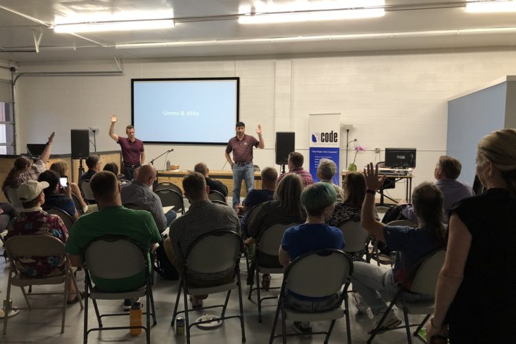
Present everything better! As co-organizer of the meetups Papers We Love – Denver and Domain-Driven Design – Denver, I was delighted to co-host PitchLab for a talk on presentation skills. Jay Mays and Keefer Caid-Loos did an excellent job explaining how to connect with your audience. Participants were engaged, and appreciated PitchLab’s approachable, ask-me-anything attitude. The […]

Read more
What makes us trust analytics, and how to argue.
fox

1. Prior experience → More trust In Trustworthy Data Analysis, Roger Peng gives an elegant description of how he evaluates analytics presentations, and what factors influence his trust level. First, he imagines analytical work in three buckets: A (the material presented), B (work done but not presented), and C (analytical work not done). “We can […]

Read more
Guide: Promoting Evidence-Based Insights
action->outcome in PepperSlice

Ugly Research offers a new guide, Promoting Evidence-Based Insights. Practical tips for presenting content with four essential characteristics: Top-line, evidence-based, bite-size, and reusable. Communicate quickly and powerfully by demonstrating value to decision makers. Show how A → B. So people don’t think tl;dr or MEGO (My Eyes Glaze Over), be sure to emphasize insights that […]

Read more
“Big E” vs. “little e” evidence, and probabilistic thinking.
man and woman about to feed each other

1. It’s tempting to think there’s a hierarchy for data: That evidence from high-quality experiments is on top at Level 1, and other research findings follow thereafter. But even in healthcare – the gold standard for the “gold standard” – it’s not that simple, says NICE in The NICE Way: Lessons for Social Policy and […]

Read more
The lean way to present to decision makers. (This isn’t a TED talk.)

There’s plenty of advice about designing presentations. But little of it prepares you for delivering complex evidence to senior-level decision-makers. This should help. How might your evidence help someone understand the steps required to reach an important goal? 1. Put together lean evidence, embracing lean management concepts. As explained by the Lean Enterprise Institute, “The […]

Read more
5 ways to tell a value story with data.
Anscombe quartet for data visualization

Source: Wikipedia. Anscombe’s quartet. Presenting to decision makers? Always remember it’s not a data story you’re telling, it’s a value story. First, ask yourself: What is the message? Why is this valuable and meaningful to your audience? Where did the data come from, and why are your conclusions believable? Then follow these 5 tips to […]

Read more
How to present like a boss.
man tying necktie

1. Present controversial evidence with just one slide. Throw out your slide deck and try the Extreme Presentation method, developed by Andrew Abela and Paul Radich during years of presentations at Procter & Gamble, McKinsey, and other leading companies. The technique involves first showing the audience the big-picture concept so they’ll immediately have a sense […]

Read more
Free beer! and the “Science of X”.
presentation science

1. Free beer for a year for anyone who can work perfume, velvety voice, and ‘Q1 revenue goals were met’ into an appropriate C-Suite presentation. Prezi is a very nice tool enabling you to structure a visual story, without forcing a linear, slide-by-slide presentation format. The best part is you can center an entire talk […]

Read more