How we decide is no less important than the data we use to decide. People are recognizing this and creating innovative ways to blend what, why, and how into decision processes. 1. Apply behavioral science → Less cognitive bias McKinsey experts offer excellent insight into Behavioral science in business: Nudging, debiasing, and managing the irrational […]
1. Biased instructor response → Students shut out Definitely not awesome. Stanford’s Center for Education Policy Analysis reports Bias in Online Classes: Evidence from a Field Experiment. “We find that instructors are 94% more likely to respond to forum posts by white male students. In contrast, we do not find general evidence of biases in […]
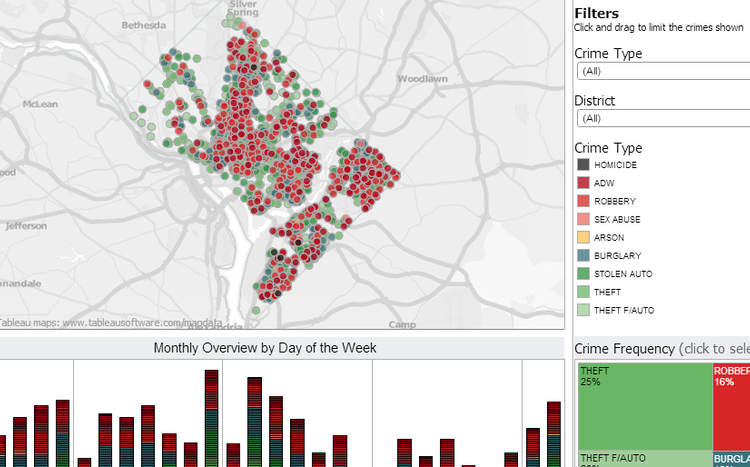
Technology helps us discover meaningful patterns: Buying behavior, criminal activity, health effects. But when we succumb to pretty pictures and mindless measurement, shiny data fails to help answer important questions. Source: Tableau. This data visualization tool would be great for someone seeking crime stats – say, for law enforcement or house buying. But it doesn’t […]

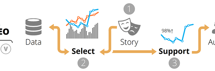
There’s plenty of advice about designing presentations. But little of it prepares you for delivering complex evidence to senior-level decision-makers. This should help. How might your evidence help someone understand the steps required to reach an important goal? 1. Put together lean evidence, embracing lean management concepts. As explained by the Lean Enterprise Institute, “The […]
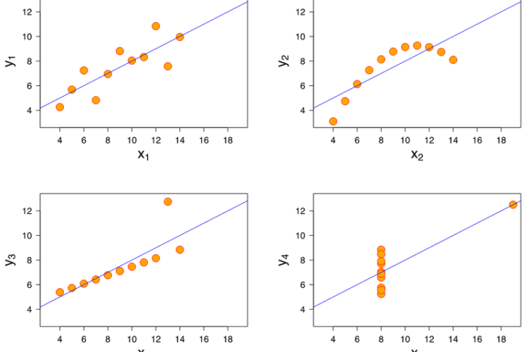
Source: Wikipedia. Anscombe’s quartet. Presenting to decision makers? Always remember it’s not a data story you’re telling, it’s a value story. First, ask yourself: What is the message? Why is this valuable and meaningful to your audience? Where did the data come from, and why are your conclusions believable? Then follow these 5 tips to […]
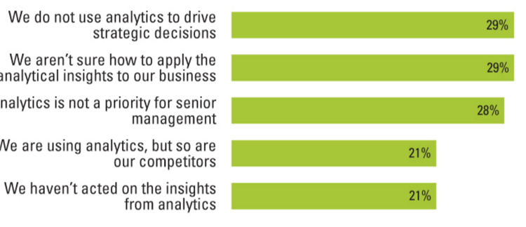
1. Visualizing networks. @Polinode builds innovative tools for network analysis. One nifty feature allows creation of column charts using a set of nodes. A recent post explains how to use calculated network metrics such as centrality or betweenness. 2. Analytics are disconnected from strategic decisions. An extensive study suggests analytics sponsors are in the trough […]